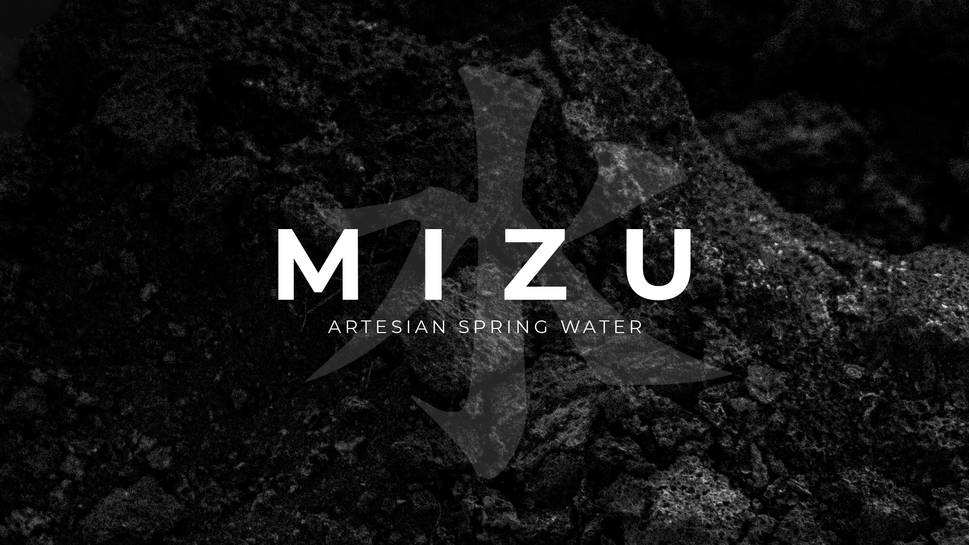

This conceptual water bottle project was built around the story of the water’s origin and the natural process that shapes its character. Sourced from deep aquifers beneath ancient volcanic formations in Hokkaido, Japan, the design draws from the idea of water slowly moving through layers of earth, rock, and time. The branding emphasizes a sense of purity, depth, and restraint, using minimal visual language to reflect the smooth, soft quality of the water itself. Every design choice supports the narrative of origin, allowing the bottle to feel grounded, intentional, and closely connected to the natural environment it comes from.
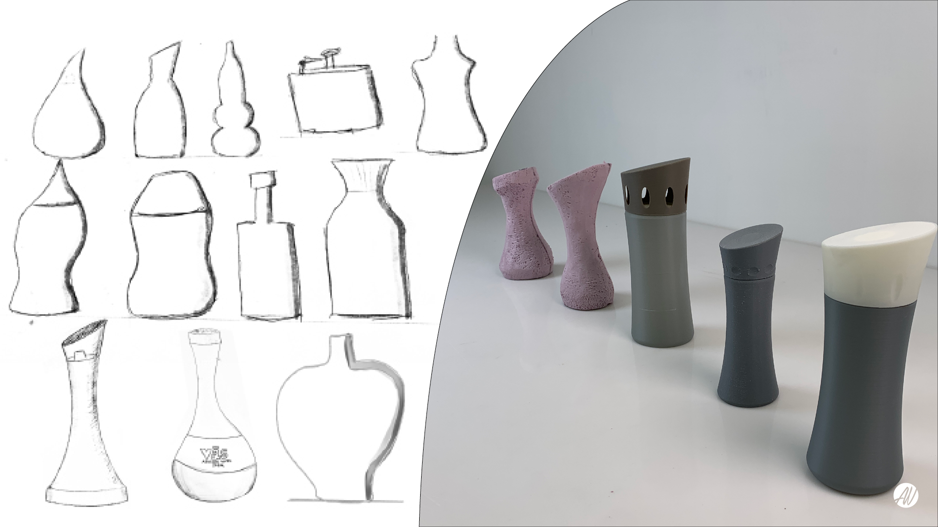
The bottle began with a round of shape exploration, using sketches and hand-held models to test how each form felt. Perfume bottles informed the final design: an oval form rather than a circle, shaped to fit the hand and invite the user to pick it up. The bottle is glass, chosen to be more recyclable than plastic.
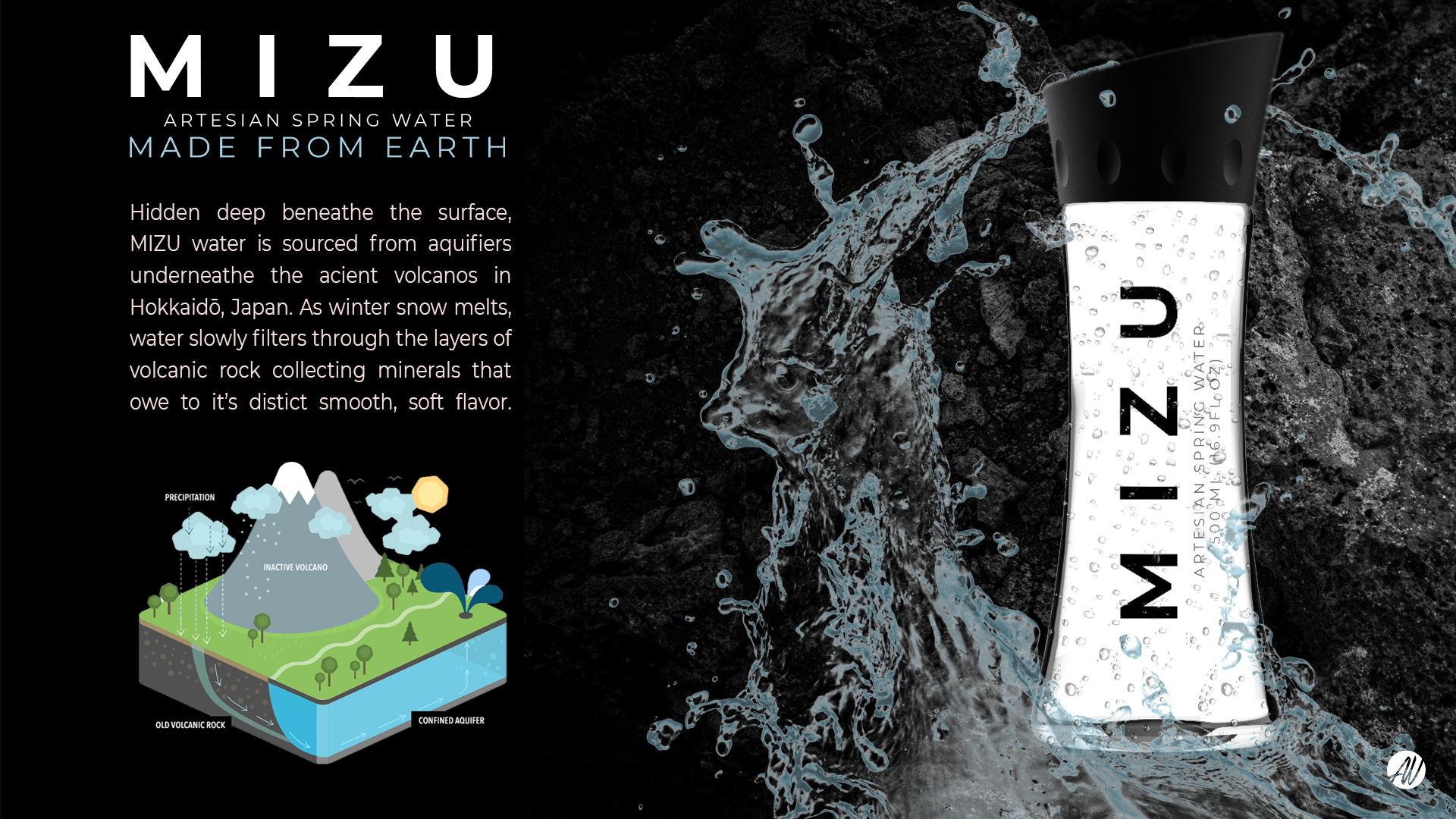
Brand identity: Mizu is the Japanese word for water. The wordmark is set in wide-spaced capitals with the tagline "Made from Earth," and a large kanji for water sits behind it on a dark volcanic rock texture. The bottle carries the name vertically in black on clear glass with a black cap, so the black and white brand matches the rock and the water.
The origin story is a concept, modeled on premium volcanic-source waters like FIJI. I researched how snowmelt and rain filter through layers of rock into underground aquifers, and used Hokkaido, where snowmelt-fed groundwater from mountain ranges is a real part of the landscape, as a believable setting. Mizu is not a real source or product.